I was brought on by the UW Dizziness and Wellness Center to conduct an accessibility audit and suggest design updates for their external website. Intended users would be new and returning patients, as well as members of the vestibular research community.
My initial accessibility assessment uncovered several issues.
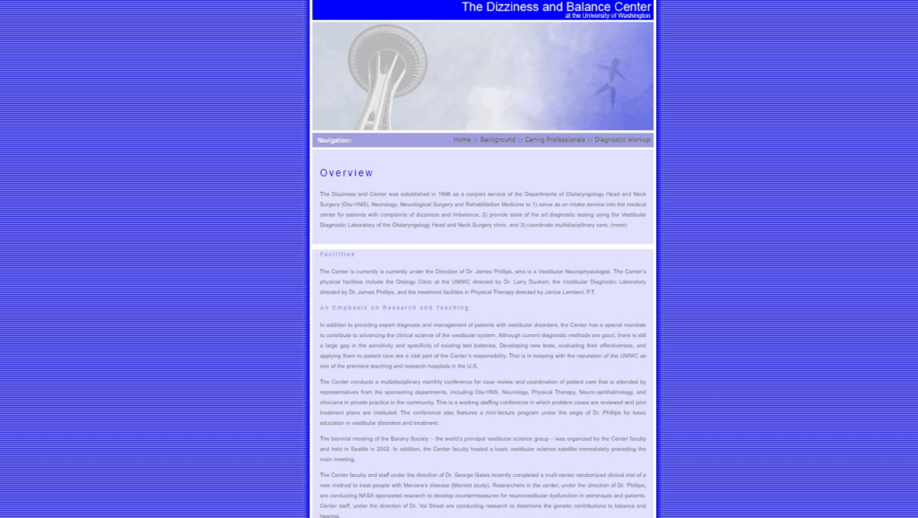
- The color choices for text, both body copy and Call to Action (CTA), did not meet WCAG AA or AAA contrast ratio requirements.
- The website background was made up of a series of tightly spaced horizontal lines that caused a strobing effect as a user scrolled through content.
- The main nav bar provided limited feedback, making it difficult for users to orient themselves.
- The content of the site was displayed in unformatted blocks of text.
- No department contact information was made available on the site.
- The staff directory was out of date and inconsistent in its design.
The site users were most likely to be individuals living with vestibular impairments, and their care providers. Keeping this in mind, my main focus was to create an experience that supported users with diminished cognitive workload capacity.
Original Color Palette – Body Content


Original Color Palette – Nav Bar

Original Background Texture

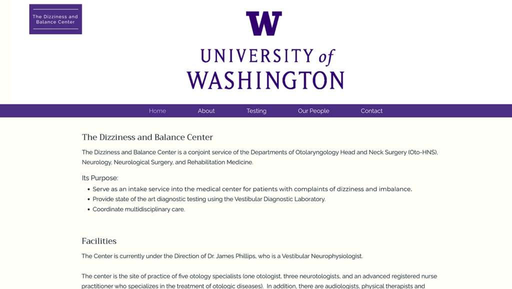
I began by scheduling a meeting with my main contact for the center to collecting information regarding their goals and requirements. Their major concerns centered around accessibility and consistency. During the meeting, I was asked to use the University of Washington logo as the hero image of the page, and to keep the color palette in line with the university’s brand guidelines. I was given the body copy to be used throughout the site and permission to change formatting as needed, but not content.
Original Color Palette – Body Content


Original Color Palette – Nav Bar


University of Washington Logo
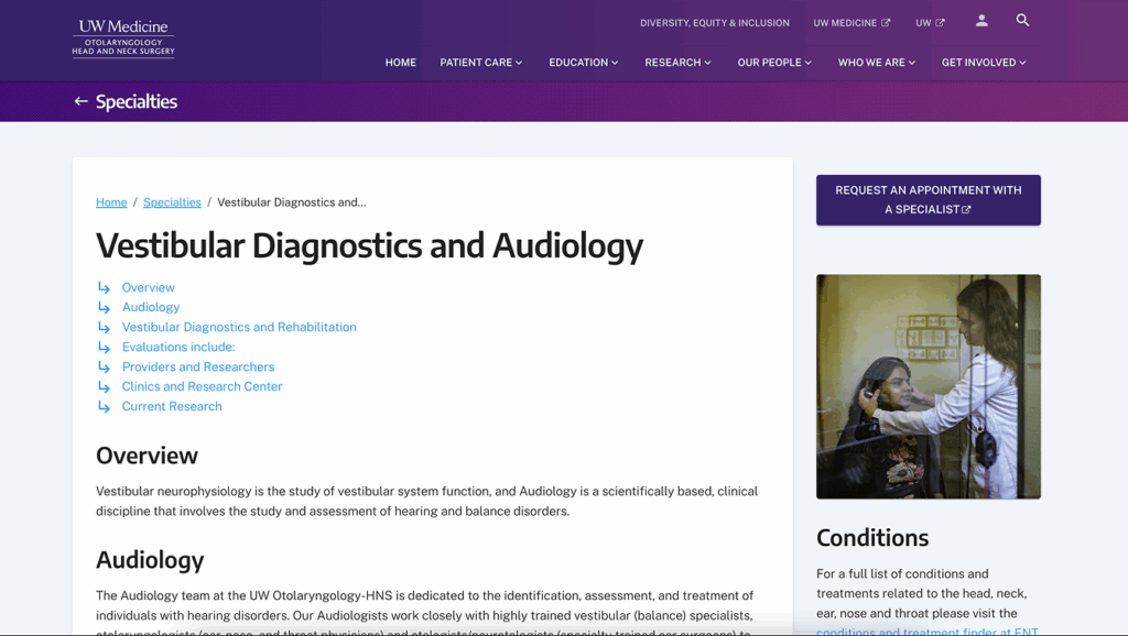
The center works directly with UW Medicine, acting as a liaison for specialized care. Patients will be interacting with online portals for clinics through UW as well as the Dizziness and Wellness Center. I wanted users to have as seamless an experience as possible while navigating across this large network of service providers, in order to do so, I had the updated page design closely resemble the look and feel of the other clinics at UW Medicine.
I was able to pull hex codes and logo files from the University of Washington style guide website, and took formatting notes from the UW Medicine webpages. Unfortunately, the center does not have the same font licensing as UW, therefore I matched the tone of the overall network with open source fonts. Using my research I put together a rough layout for the new Dizziness and Wellness Center website. The new layout kept the basic structure of the site as it aligned with those used by UW Medicine. I broke up the larger blocks of text to make the site easier to parse and ensured all text was high contrast to aid with visibility.
A full contact page was added along with multiple quick links directing users to it from other areas of the website. Current and prospective patients were most likely to be using the website as a means to either find contact information for the department, or to look up travel directions to one of the clinic buildings. It was important that maps be imbedded in the contact page to reduce the amount of time spent searching by users.
I addressed the nav bar and CTA feedback issue with hover animations as well as highlighting the active nav bar link.
Unfortunately, the department was unable to provide a current staff roster and asked that an “under construction” page be created until they were able to properly update their data.
I forwarded my designs mockups to my contact at the center and got final approval. I then constructed the site using Wix, transferred ownership to the Dizziness, and Wellness Center and it was activated on their end.
“Julia updated our clinic website to improve its look and accessibility. Her consultation with me on what I wanted was excellent and professional, leading to a clear list of what I needed to provide her to include on the site. The website she built was beautifully laid out, and easy for patients to navigate. I would recommend her services to anyone who needs a website built.”
- Jennifer Brodsky, PhC, DPT